Tribute to Dolly Parton
Process Notes
GRAPHIC DESIGN

When Dolly Parton passed away, I wanted to make something worthy of what she represented: not just another memorial post, but a piece built on contrast, because contrast is the principle I always design with.
Concept
The background isn't decorative: it's a reference to her Imagination Library, the foundation she ran to get books into children's hands. The composition grows out of that reference, not the other way around.

Typography, the central contrast
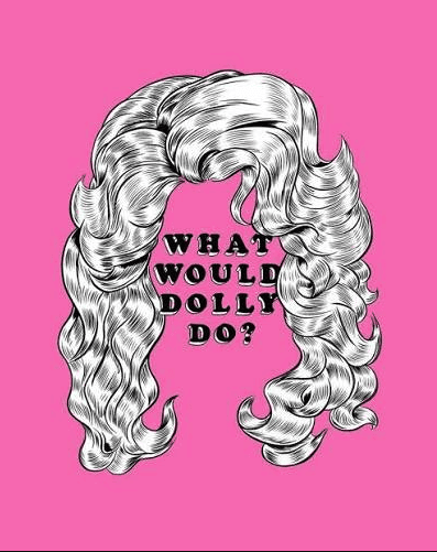
For decades, Dolly Parton was associated with a femininity read as harmless, superficial. But the way she actually lived was punk in the truest sense: instead of hoarding wealth as a millionaire, she gave back to her community. I chose a punk typeface precisely for that contrast, between how she was perceived and who she really was. The background had to give that lettering just enough visual contrast to hold it: without that, the idea would get lost.

Color
Pink isn't harmless by default either. It's a color with an uncomfortable history: from colonial use to insecticide, dressed up as innocent for centuries and read as 'feminine' without question. Using it here is the same move she made with femininity: taking a historically diminished symbol and turning it into power.

Composition
She appears in black and white, off to one side, so the pink, the typography and the circles , carries the chromatic and conceptual weight of the piece. The circles aren't filler: they stitch the portrait to the text so it reads as a single idea, not two elements stuck together.
The whole piece came together in five minutes. (no IA) Working fast didn't mean working loose: it still had to feel structured and hit hard, without tipping into overload. That's the balance I was after — minimalist, but carrying the full weight of what the message needed to say, closing on: "Punk will always stay alive. Be punk. Be Dolly. Be you."
*Portrait illustration (imagen 5)within the piece: Dolly Parton by Mallory Heyer.

More to Discover


Tribute to Dolly Parton
Process Notes
GRAPHIC DESIGN
When Dolly Parton passed away, I wanted to make something worthy of what she represented: not just another memorial post, but a piece built on contrast, because contrast is the principle I always design with.
Concept
The background isn't decorative: it's a reference to her Imagination Library, the foundation she ran to get books into children's hands. The composition grows out of that reference, not the other way around.
Typography, the central contrast
For decades, Dolly Parton was associated with a femininity read as harmless, superficial. But the way she actually lived was punk in the truest sense: instead of hoarding wealth as a millionaire, she gave back to her community. I chose a punk typeface precisely for that contrast, between how she was perceived and who she really was. The background had to give that lettering just enough visual contrast to hold it: without that, the idea would get lost.
Color
Pink isn't harmless by default either. It's a color with an uncomfortable history: from colonial use to insecticide, dressed up as innocent for centuries and read as 'feminine' without question. Using it here is the same move she made with femininity: taking a historically diminished symbol and turning it into power.
Composition
She appears in black and white, off to one side, so the pink, the typography and the circles , carries the chromatic and conceptual weight of the piece. The circles aren't filler: they stitch the portrait to the text so it reads as a single idea, not two elements stuck together.
The whole piece came together in five minutes. (no IA) Working fast didn't mean working loose: it still had to feel structured and hit hard, without tipping into overload. That's the balance I was after — minimalist, but carrying the full weight of what the message needed to say, closing on: "Punk will always stay alive. Be punk. Be Dolly. Be you."
*Portrait illustration (imagen 5)within the piece: Dolly Parton by Mallory Heyer.
More to Discover
Tribute to Dolly Parton
Process Notes
GRAPHIC DESIGN
When Dolly Parton passed away, I wanted to make something worthy of what she represented: not just another memorial post, but a piece built on contrast, because contrast is the principle I always design with.
Concept
The background isn't decorative: it's a reference to her Imagination Library, the foundation she ran to get books into children's hands. The composition grows out of that reference, not the other way around.
Typography, the central contrast
For decades, Dolly Parton was associated with a femininity read as harmless, superficial. But the way she actually lived was punk in the truest sense: instead of hoarding wealth as a millionaire, she gave back to her community. I chose a punk typeface precisely for that contrast, between how she was perceived and who she really was. The background had to give that lettering just enough visual contrast to hold it: without that, the idea would get lost.
Color
Pink isn't harmless by default either. It's a color with an uncomfortable history: from colonial use to insecticide, dressed up as innocent for centuries and read as 'feminine' without question. Using it here is the same move she made with femininity: taking a historically diminished symbol and turning it into power.
Composition
She appears in black and white, off to one side, so the pink, the typography and the circles , carries the chromatic and conceptual weight of the piece. The circles aren't filler: they stitch the portrait to the text so it reads as a single idea, not two elements stuck together.
The whole piece came together in five minutes. (no IA) Working fast didn't mean working loose: it still had to feel structured and hit hard, without tipping into overload. That's the balance I was after — minimalist, but carrying the full weight of what the message needed to say, closing on: "Punk will always stay alive. Be punk. Be Dolly. Be you."
*Portrait illustration (imagen 5)within the piece: Dolly Parton by Mallory Heyer.